
“Future Chart Issuing Program” Ver.2.1 (2018/03/30) English version (April 6, 2018) is released!
【Future Chart Issuing Program version 2.1 Instruction Manual】
Thank you for downloading the Future Chart Issuing Program.
1. please download from here. There are about 33 MB.
2. Please set “Enable editing「編集を有効にする」”. Also, please press
“Enable Content「マクロを有効にする」” to activate the macro.
3. Please enter the municipality code in the yellow cell on the top right of
the first page. Municipality code can also be confirmed in “Municipality
code” tab.
4. If you move the cursor to the leftmost cell and scroll it, it is easy to
see.
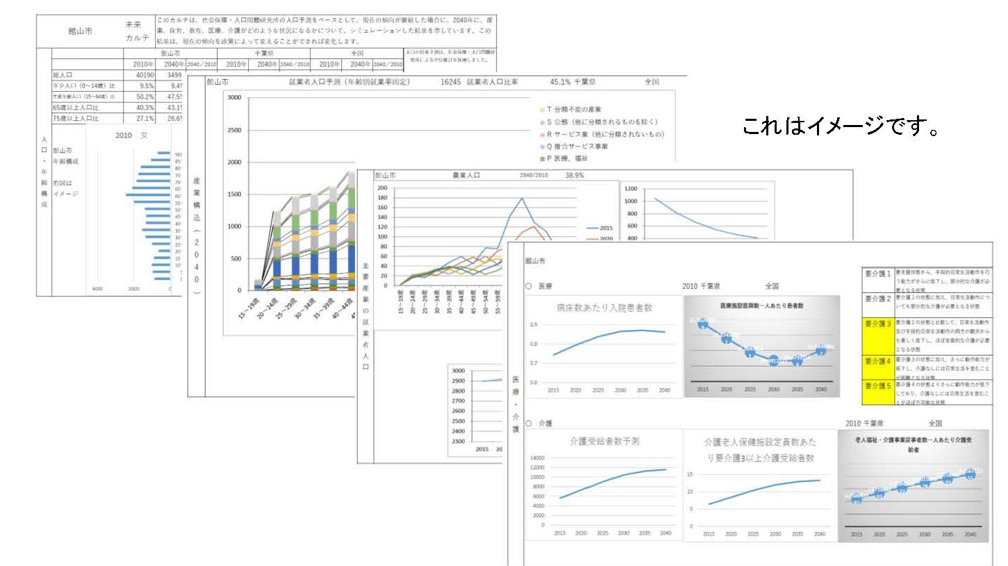
On the 5.2nd page, the horizontal axis of the graph of “Age composition” is
automatic adjustment. To make it the same width, please click on the
horizontal axis of the graph and align “maximum value” of “boundary value”
with “axis formatting” – “axis option”.
6. Blowing out graphs of “Industrial Structure (2015)” and “Industrial
Structure Forecast(2040)” is automatic adjustment. Please adjust to a
position that is easy to see.
7. The vertical axis of the graph of “Industry structure by age (2015)” to
“Industry structure by age (2040)” is automatic adjustment. To make it the
same vertical width, click the vertical axis of the graph and align “Maximum
value” of “boundary value” with “Format of axis” – “Option of axis”.
8. The blowing out of the graph of “Food production volume (weight base)”
and “Amount of crops and fishing sales” of “Agricultural land, and
agriculture and fisheries” is automatic adjustment. First, right-click on
the pie chart, select “Select data”, and uncheck “Horizontal (item) axis
label” for items with “0” in the right column. Then, adjust the air outlet
to a position that is easy to see.
9. The pie chart of “Estimation and supply amount of renewable energy
facilities” of “Forests and Forestry / Renewable Energy” is automatic
adjustment. First, right-click on the pie chart, select “Select data”, and
uncheck “Horizontal (item) axis label” for items with “0” in the table on
the next page. After that, please adjust the percentage to a position that
is easy to see if necessary.
If you have any questions, please contact us at ![]()
![]() .
.
この記事へのコメントはありません。